

Learn Taíno App
Designing an Engaging Language Learning Experience for Taíno Speakers

Foundational Onboarding & Mascot Integration (Prior Work)


Process Challenges
Tight timeline
With four 2-week sprints, the team proposed ideas like social features but soon found them out of scope.
Solution
We scaled back prioritized designing the first lesson as the foundation for the app’s future lessons.
No project manager
Without a PM, the team struggled with task management and alignment.
Solution
I took the initiative to create a Notion doc and Kanban board, ensuring design team alignment.
No language expert
Lacking a language expert with pedagogical expertise made lesson structuring difficult.
Solution
Instead, we collaborated with Casa Areyto to adapt the content respectfully, keeping it accessible and engaging for learners.

While the previous phase focused on competitive analysis with an emphasis on UI design, we recognized the need for additional research on lesson structures, activity types, and mascot integration. I specifically researched Duolingo, while the rest of the team analyzed three other language learning apps. This research helped us design the first lesson and Zunzún’s role, ensuring a more engaging and interactive user experience.
Key Findings
Engaging, Bite-Sized Learning
Lexical Sequencing Approach
Duolingo’s lexical sequencing approach, where new vocabulary builds on previous lessons, informed our lesson structure.
Common Interactive Activities
Common interactive activities across all apps included word matching (audio, Image, written), translation, listening exercises, and multiple-choice questions.
Mascot-Driven Motivation
Duolingo’s mascot, Duo, boosts motivation and keeps learning fun by celebrating wins and adding a playful vibe.

Drawing from insights gained during competitor analysis, the team collaborated with product strategy, the client, and the writing team to define key lesson goals and structure the content into manageable segments. This led to the creation of a modular flow that kept lessons concise and engaging, with clear sections for introduction, interactive vocabulary, practice, cultural insights, and review.


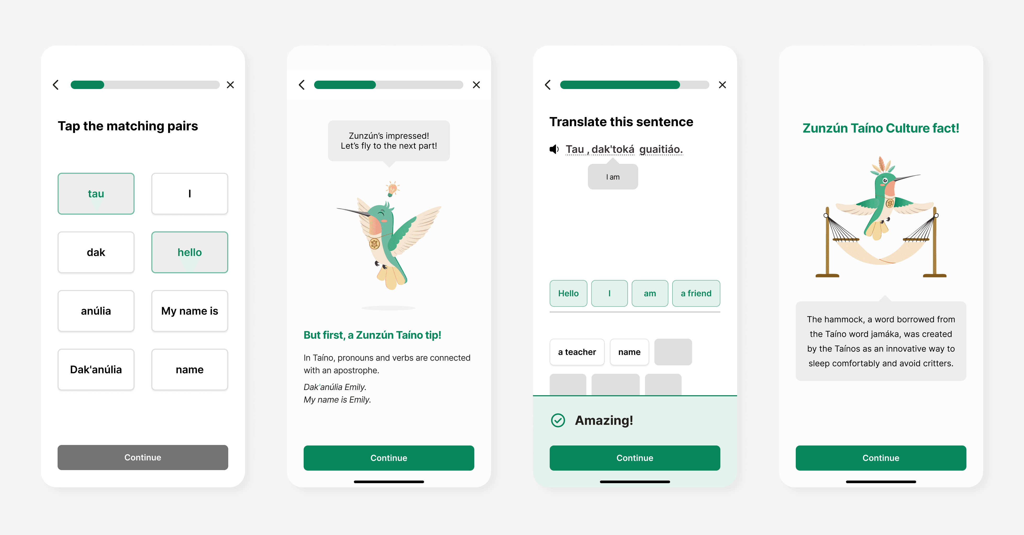
Since the content was still in development, we went through multiple iterations. A challenge was defining ZunZún’s role: whether to offer encouragement, provide cultural insights, teach vocabulary, or guide users. We decided he would fulfill all these roles, supporting users throughout the lesson. To prevent information overload, we moved his cultural fun fact to the end, allowing for a smoother flow. As we collaborated with the writing team, we added more vocabulary and grammar, which expanded the flow but enhanced its effectiveness.


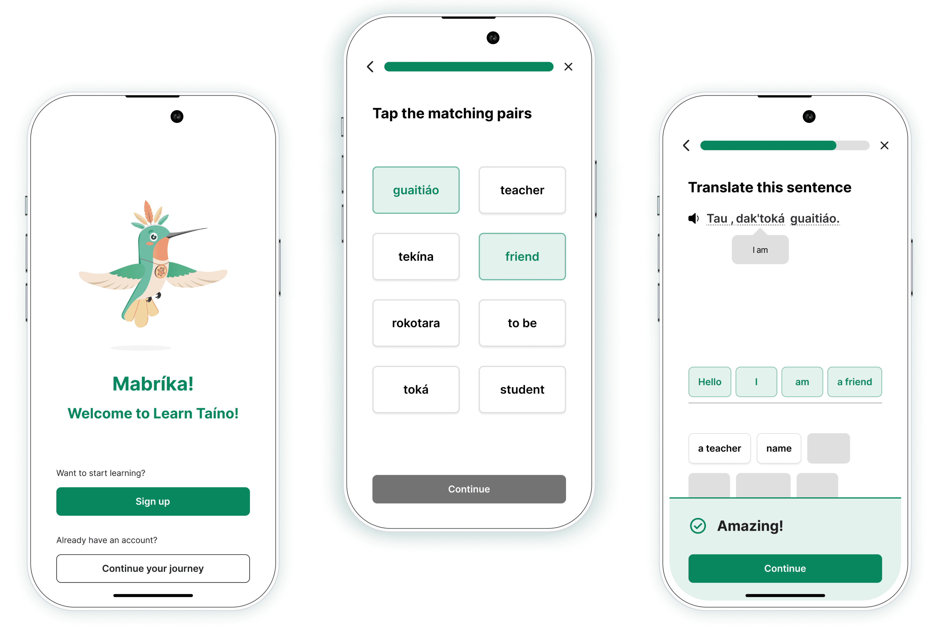
As we were working on the lesson structure, I began wireframing the mid fidelities although the content wasn’t finalized. One of the main goals for this lesson was to incorporate a review section, and I began designing a matching pairs wireframe as a form of review. We also started adding the mascot placeholder screens with the intention to further develop the tone with the writing team. We also started exploring how to incorporate the cultural insight.

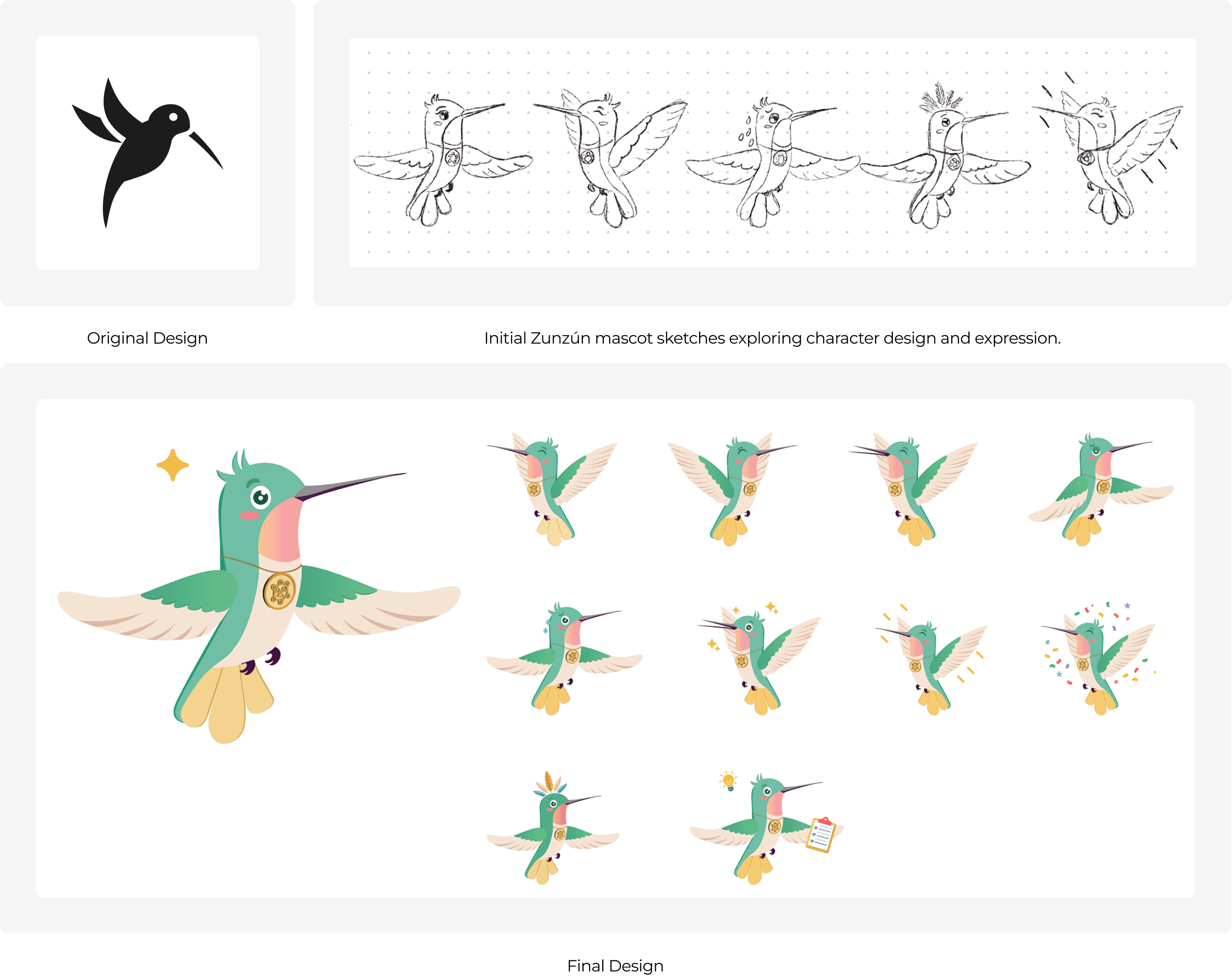
I redesigned Zunzún from a simple outline into a vibrant, culturally rooted guide, infusing Taíno symbolism like the El Sol de Jayuya medallion and tropical colors to reflect heritage. Inspired by Duolingo’s approachable mascot design, I crafted Zunzún’s playful animations and encouraging interactions to celebrate learner progress and foster cultural pride. The result is a dynamic mascot that bridges modern engagement with Taíno identity, supporting learners of all ages through an educational and culturally enriching journey rooted in the app’s mission.
The high-fidelity wireframes were refined to include audio across all activities, enhancing the user experience with pronunciation practice. ZunZun’s final design, discussed further in the branding section, was developed to align with the visual identity and tone of the app. These updates were made to create a comprehensive prototype, which would be tested with users to ensure the design met usability goals and provided an engaging learning experience.

Results
My takeaways
Next Steps
Refine lesson one
Users found the mini-lesson unclear within onboarding, so we will refine the flow for better distinction. New vocabulary cues will be updated with larger, color-coded text for clarity. Additionally, we will explore pronunciation exercises to help learners practice speaking out loud.
Collaborate with developers
We will work closely with the development team to ensure a smooth handoff by providing detailed designs and documentation.
Expand Lesson Content
After refining Lesson One, we will move forward with designing Lessons 2–4, aiming for a June 2025 launch.
Expand Lesson Content
Collaborate with the strategy team to prioritize and design additional app components like the review section and user profiles (to personalize the experience).


